Spot Hound
Spot Hound
Client: Designation
Role: UI Designer
Deliverables: Branding, Style Tiles, High-Fidelity Mockups, Prototypes
Time: 4 weeks
Tools: Sketch, Photoshop, Illustrator, Flinto, Affinity Photo, Affinity Designer
Challenge
In four one-week Google Design-style sprints, design a mock mobile app to help Chicago drivers park in an exact area based off current city parking rules and regulations.
Initial Ideas
Before coming to Chicago for Designation, I had limited experience with parking apps. In my hometown, low density and relaxed parking rules allow people to park in a lot of areas for a small cost or free. However, I knew things would be drastically different in Chicago after hearing parking horror stories from local family and friends.
To be somewhat prepared, I downloaded a local parking app called Meter Beaters to test free parking downtown one weekend. Although the app told me I could park on my target street in advance, there was a glaring parking meter sign eager to greet me when I arrived.
I soon realized my experience was just a snippet of parking frustration many Chicagoans face everyday. Chicago's confusing parking rules, signs, and regulations make it laughably easy for one to get a ticket.
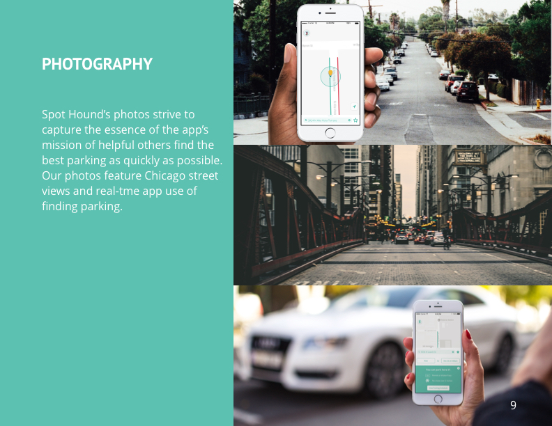
Photos from The Expired Meter
To combat parking paranoia and the incredible time sink of map research, a Designation UX team developed a solution for Chicago parking hassles. Their end product, a responsive micro site for the City of Chicago, was successful. Yet, the need for users to get faster parking results in real time led the UX team to change course and suggest creating a stand-alone mobile app. Our UI team needed to bring these changes to life, while building a fresh branding identity separate from the city's current portrayal.
Approach
Research
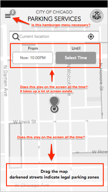
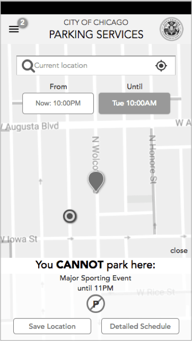
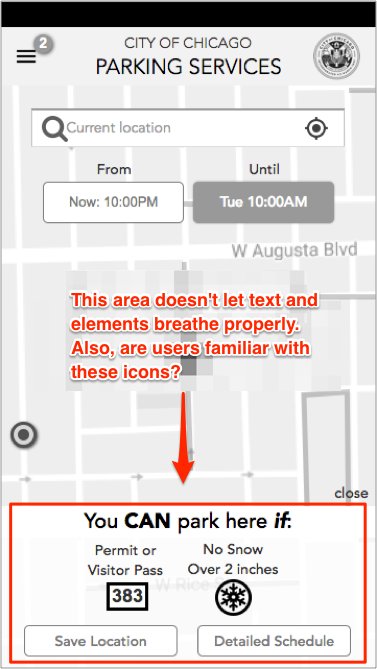
Before diving into our design strategy, we analyzed key screens from UX wireframes and met with the UX team to understand the micro site.
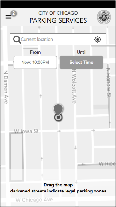
Home Screen
Users view their current location, search for parking, and choose parking times.
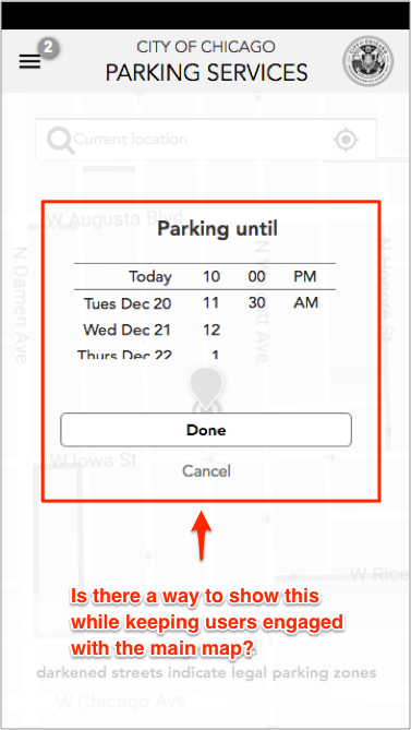
Time Selection Screen
This modal allows users to set specific time lengths for parking.
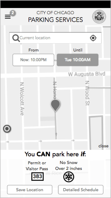
Parking Alert Screens
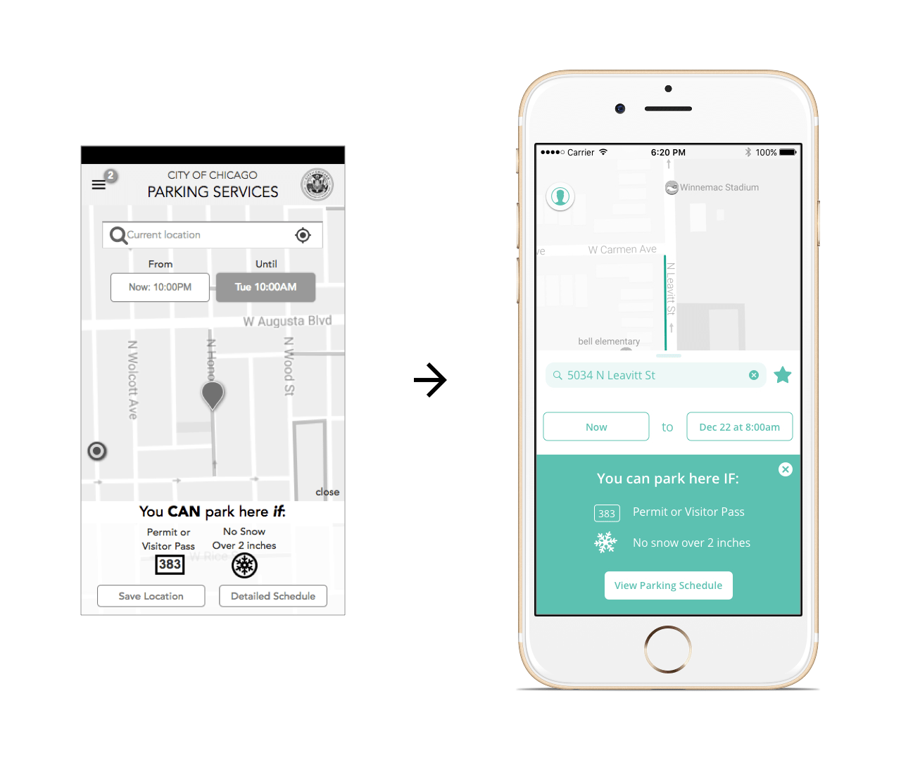
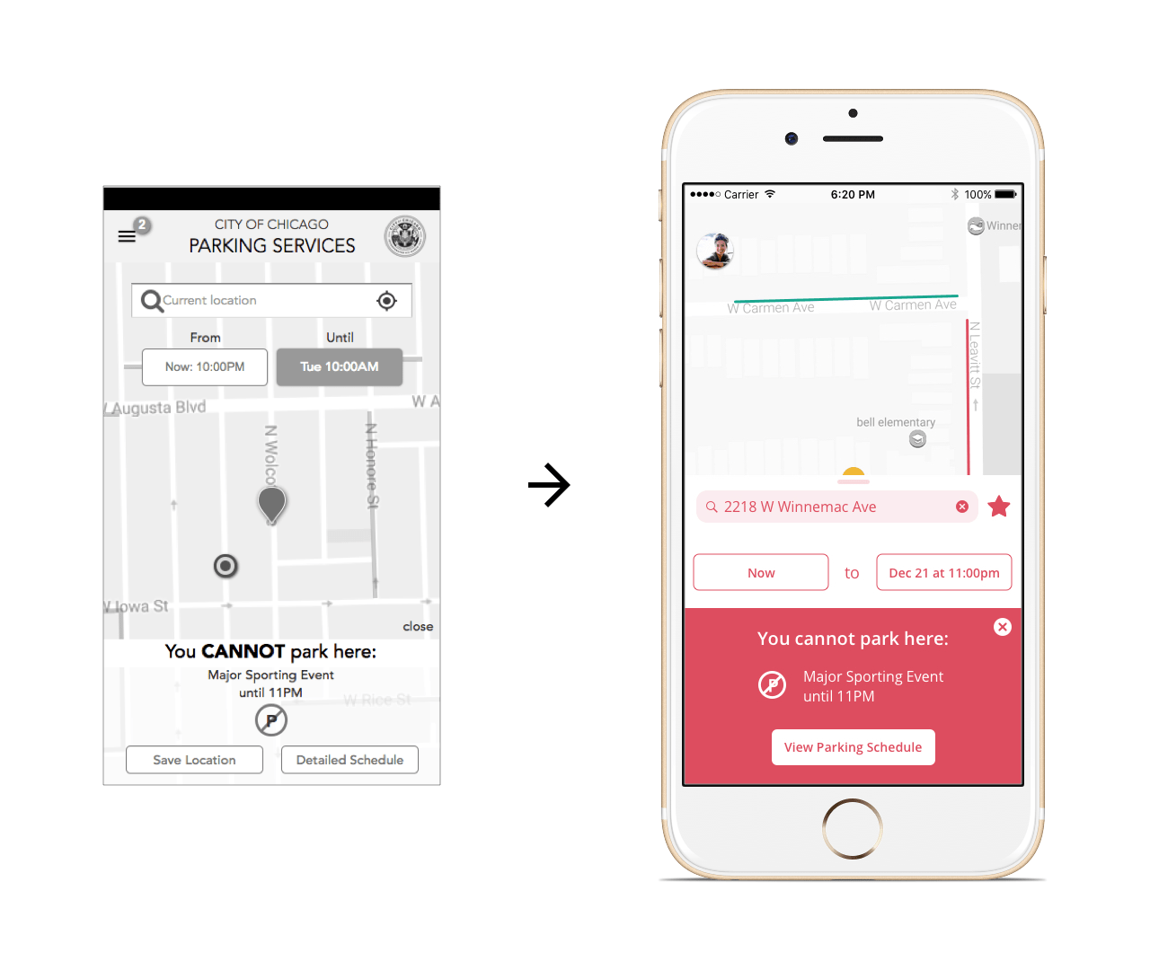
When users drag the map to highlighted streets, they receive an alert stating why they can or can't park there.
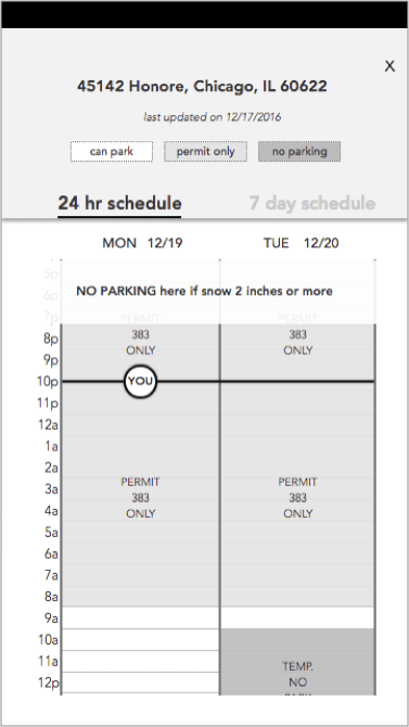
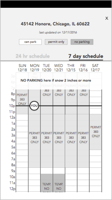
Parking Schedule Screens
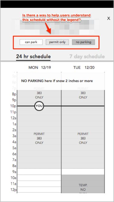
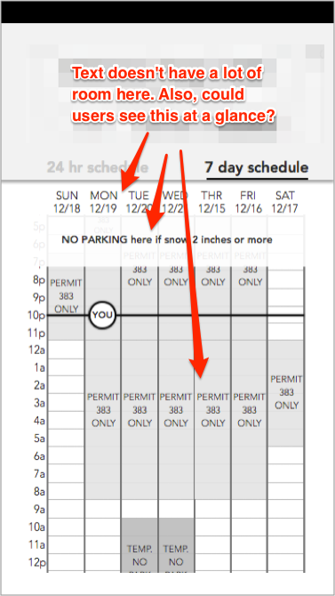
Users toggle 24-hour or 7-day views of street parking, while viewing parking rules and regulations in the immediate area.
Primary Flow
Secondary Flow
Along with analyzing wireframes, building user empathy was important for our team to know exactly who we were designing this app for. We reviewed three personas from the UX team’s research and focused on two we felt would benefit most from the app.
Naomi
Naomi is a professor in her 30s seeking short-term parking at her home during the day and long-term parking while on vacation.
We felt Naomi represents a large group of Chicago residents who experience similar daily parking dilemmas. Although she has a neighborhood parking sticker and a general idea of parking rules, she still faces the grey area of unclear parking times.
Matteo
Matteo is a suburbanite looking for fast event parking, while impressing his girlfriend with street smarts.
We thought Matteo would be a great persona as there's a large number of people who come to Chicago for events and want to save as much money as possible. Also, there are people who can’t find event parking, due to garages and lots reaching full capacity sooner than expected.
After studying both personas, we determined potential users should view this app as a tool first.
“To know exactly when and where they can park at any given time is top priority.”
Also, since the app is a product of the City of Chicago, users should expect to see its official nature along with representations of the city. The app’s presence couldn't be stale and unconcerning like the current user experience. It needed to appeal to users and provide clear information to help them park fast.
Before beginning the design process, our team looked at the competition for current market examples. Aside from map design, we noticed a lot of competitor app features, such as Spot Hero’s real-time alert patterns or Meter Beaters’ street parking indicators.
Spot Hero updates users with instant parking information.
Meter Beaters green lanes help drivers find free parking fast.
Then, we looked other inspiring apps to find other helpful features for our designs. One important feature was Lyft’s use of casual voice. Using informal, approachable text would help our app have a trustworthy presence, instead of an authoritative, impersonal aura typically tied to anything from the government.
Another feature we found useful was Apple Map’s bottom search bar position. The UX wireframes placed the search bar at the top of the screen and our team immediately questioned its purpose.
Before approaching the UX team with design questions, I added wireframe screens to a large smartphone to test usability and flow. I struggled to access top navigation, leading me to believe users would experience similar issues. Our team chose to push back against UX research and design bottom navigation elements for easy access.
Next, our group felt it was necessary to develop a strong set of design principles to uphold throughout the project. Due to us having many available parking apps to reference, we felt our designs could get carried away. Also, we needed this app to speak to Chicagoans by presenting proper visuals to inspire civic pride.
Casual
Keep it casual and nix legal jargon. Through a familiar tone of voice, our users will gain confidence to park properly without hesitation and anxiety.
Fast
Build confidence through design by making Chicago parking information accessible in as little clicks as possible.
Responsive
Doing heavy lifting, always making real-time updates for Chicago parkers, and reassuring them through our microinteractions.
Then, I thought of a past team discussion of how the app should represent Chicago and I brainstormed ways to capture the app’s visual sense and users. I wanted to balance officiality, reliability, and friendliness, as too much of either could break the user experience.
I searched for inspiration from common elements like the city seal or flag, but gravitated to a lot of structural elements with varying color palettes. Creating mood boards inspired me to form a clearer idea of what users may want to see in the app. Then, I designed style tiles and fielded reactions and feedback from team members, program directors, and people in the 1871 space.
The first style tile, Thrifty Blue, came from the idea of drivers navigating city street grids while saving money from parking traps. My color palette featured light blue as the primary color for its approachable feel, while hot pink served as the secondary color for alerting drivers to important actions. Quirky, outline icons gave the app a youthful touch.
Candy Grit was a high-energy take on the idea of finding parking in the city. I wanted the chore of parking to turn into a fun theme park ride for users, which explains the use of bright colors. Also, I used a bold, san-serif font to express the app's energy in a modern state.
The strongest style tile, Vintage Gotham, came from a mixture of architecture from The Dark Knight Trilogy and retro diner themes. I stuck with clear, sans-serif fonts and added filled icons to reduce user cognitive load.
Brand Exploration
Our team hunt for the ideal app name wasn't an easy feat.
After gaining a sense of design direction from style tiles, we dove into our branding process. Although the app serves as a credible City of Chicago source, our group felt it should have its own identity to attract our target users. We thought users wouldn't be receptive to an app with branding like the city site, as it could bring up negative parking flashbacks.
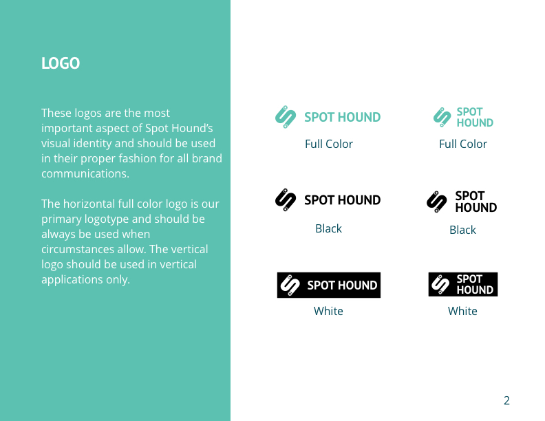
Then, I had an app-naming brainstorm session with the team. The bulk of our names revolved around “Park,” “Spot,” and various animals. Soon, our conversation dipped into how parking sometimes feels as if one is a bloodhound hunting for a rabbit. We wanted users to relate to that experience in an instant, so Spot Hound became the winning name for our app.
Moving deeper in the branding process, I thought of the logo’s potential impact on users and sketched many variations.
I didn’t want to limit myself to dog sketches, so I played with different concepts and guerilla tested a few. My strongest concepts were plays on light beacons and an S-shaped road.
Many people liked my light beacon logos, but felt they had too much of an invasive presence. I didn’t want any “Big Brother” notions attached to Spot Hound, so I changed my approach.
After receiving more positive reactions to the “S-shaped road sketch,” I iterated more until reaching a design to vectorize.
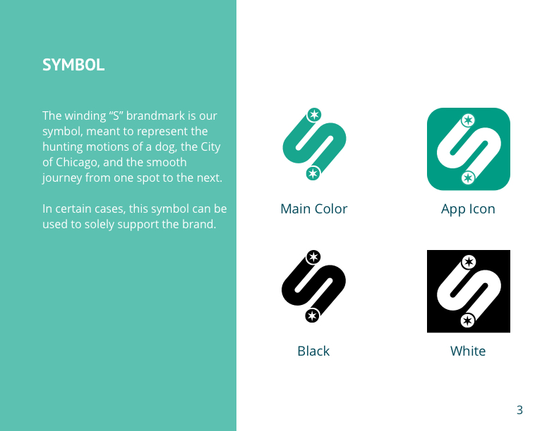
Next, I thought of what I could apply to make the logo Chicago-official and recognizable. I made more iterations, tightened the S curve, and increased stroke weight to make the final logo easy to recognize at different sizes.
My final logo inspiration was a combination of the winding road, a dog's hunt, and stars from Chicago’s flag.
After designing Spot Hound logos, our team created final style tiles to present to program directors for feedback.
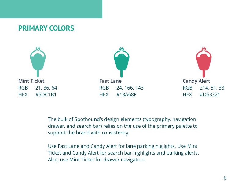
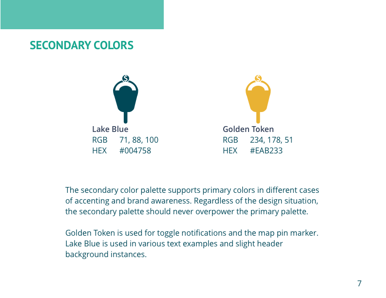
Vintage Gotham remained my strongest style tile. Yet, I struggled with accepting my color palette. Some people were fine with green as my primary color and others suggested I use a variation of blue. After more talks, I realized many people tie the color blue to a lot of official Chicago things like the Chicago Transit Authority or Chicago Cubs. In the end, I stuck with green, as I felt it spoke to users’ needs of reliable parking and saving money.
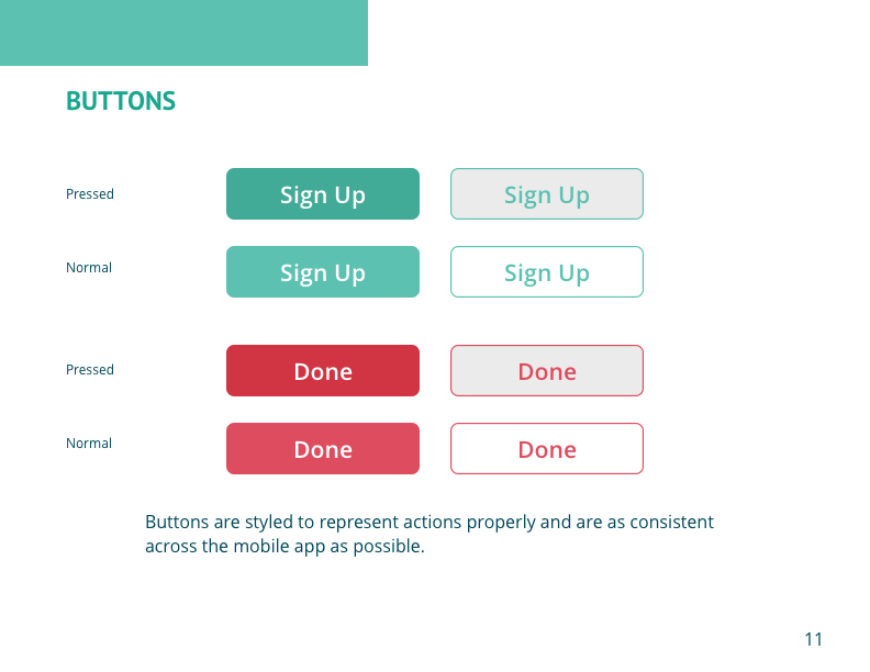
Before designing in high-fidelity, I created a UI kit to reference common elements across key screens.
High-Fidelity Mockups
Home Screen
I moved the search bar to the bottom for easy access, removed time selection elements and the city header to allow more map focus, and placed on-boarding text up top for fast reading.
Parking Alert Screens
When the pin marker lands on a highlighted street, parking alerts pop up under the search bar and time selection bar. Alerts feature any details of parking rules and regulations.
Parking Schedule Screens
To make better use of the screen and boost user visibility, I removed the header bar and made fonts bigger. Also, I replaced toggles with tappable months, swipe-able dates, and scrollable time sections.
Time Selection Screen
I replaced the modal with a date picker and placed it under the search bar and time selection bar for easy thumb access.
Microinteractions
Rotating Logo Stars
A simple animation for a splash page or a loading screen.
Sad-to-Happy Car
The shift of an empty state to an active success state when a new user signs up.
Pin Marker Pulse
Pin marker alerts users when it lands on a street with active parking rules and regulations.
Steering Wheel Modal
This simple success modal appears after a user completes the sign-up process.
Location Indicator
A simple, pulsing field to let users know exactly where they are on the map.
After creating microinteractions, I reached the prototyping phase of the design challenge. Based on high-fidelity screen feedback from my teammates and program directors, I felt more confident in giving life to my screens. Before prototyping, our group discussed app flow and shared design principle examples from our screens. After reviewing those examples and ensuring they would be helpful to users, we began building our prototypes.
After building my prototype, I created a responsive marketing site to highlight Spot Hound’s value as an efficient parking app. Site features include a “How it Works” section with simple steps for key app flow, parking tips and event blog, support page, and various call-to-action buttons for downloading the app.
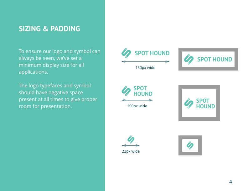
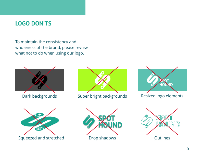
Also, I created a style guide to keep design language consistent and give development teams a solid, app-styling reference.
Future Considerations
If I had more time for the project, I would:
Adjust my color palette. I thought my primary green color would be a great fit because of its reliable feel and use as a confirmation signifier. Yet, my overuse of green made its relationship with different screens hard to understand. I would like to reduce the color's use to an alert to provide balance and bring clarity to map reading.
Place more emphasis on building meaningful microinteractions. After viewing them in hindsight, I realized many were digital decoration and not supporting app usability. I would make sure future designs reinforce the “Responsive” design principle and set up user tests to validate app usefulness.
Insights
This design experience was unique to anything I experienced before. Six weeks before this challenge, I spent my time completing solo, virtual UI projects and wasn't sure how my skills and experience would fit in a group environment. To see a project through all phases in person with a team was incredible and challenged me to step out of my comfort zone, trust my team, and stay accountable to them while taking care of individual steps.
There were times when my frustrations reached peaks (understanding UI map design and adjusting to workflow interruptions) and moments when I surprised myself (building group presentation templates, pivoting from Android design to iOS design, and dropping Proto.io halfway in the project to learn Flinto in less than a day).
My ultimate lesson was to stop designing for myself and always keep the user in mind first. I thought I knew exactly what users wanted to see without doing proper testing to approve decisions. This led to a few design failures near the project's end, such as attempting to use red and green for different states and receiving unclear interpretations.
The experience opened my eyes to powerful change one can achieve through design. I implemented that power in my next project by finding more ways to be efficient with my time, not being afraid to fail faster, and placing empathy at the forefront.
Thank you for your time!


